-
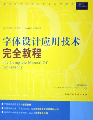
字体设计应用技术完全教程
本书是美国艺术与设计专业品牌教材,是关于字体设计应用的基础知识的基础读物,同时具有一般广泛性,从字体设计的宏观到微观,都有详实的描述。文字朴素、简洁,内容又是如此的充实和具体,它将告诉你:怎样的字体才美观?如何来应用字体并使其美观?换句话说,就是告诉你如何专业地设计编排字体。它从实践的角度解释了如何运用现代的计算机辅助工具来实现优秀的设计:排版出色的字体。 本书图文并茂,(《字体设计应用技术完全教程》对于所有从事版面设计工作的人来说都是一本必备的参考书。设计师、印刷出版专业人士等读者可以直接查找索引来获取相关问题的答案;教师和学生则可以从头至尾地阅读。将其作为一本教科书。你可以在本书中学到以下内容: 1.通过索引来体现对优秀排版基本概念的阐述和剖析,忙碌的专业人士可以将其作为快速查找的参考手册。 2.如何在操作系统上管理字库和处理损毁及缺失字库。 3.字体设置的关键。 4.处理行宽、磅数、行距、紧排和其他字体基本要素的技巧。 5.调整排版问题:松散的行、难看的不齐行边缘、寡行和孤行等的实用技巧。 6.介绍了处理分词与齐行、缩进、对齐、文本围绕和专门字符集等问题的规则。 7.如何用不适配的字体处理程序和版面程序生成出色的版面。 -
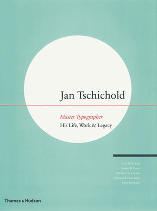
Jan Tschichold
Few have left a deeper impression on the world of typography than Jan Tschichold (1902â74), one of the most outstanding and influential designers of the 20th century. Not only was he was a master in his field, but he wrote a number of highly influential books and became instrumental in promoting the modernist design strategy called the New Typography. This substantial volume covers Tschicholdâs life and career, placing the designerâs vision firmly in the rich cultural and historical context of his era. Tschichold embraced avant-garde ideas from movements such as the Bauhaus and De Stijl and made them accessible to working designers and printers, stressing clarity in communication, with form and function going hand in hand. The contributing writers discuss the designerâs major influences and the highlights of his varied career, including his seminal poster designs, his groundbreaking work with Penguin Books, and his creation of the classic typeface Sabon. Lavish illustrations â archive photographs, many published here for the first time, as well as copious examples of Tschicholdâs work â accompany the text, confirming that Tschicholdâs heritage lives on in the digital age, and proving that he is amongst the greatest typographic designers ever. -
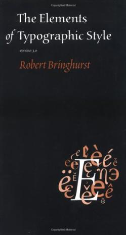
The Elements of Typographic Style
Renowned typographer and poet Robert Bringhurst brings clarity to the art of typography with this masterful style guide. Combining the practical, theoretical, and historical, this edition is completely updated, with a thorough exploration of the newest innovations in intelligent font technology, and is a must-have for graphic artists, editors, or anyone working with the printed page using digital or traditional methods. -
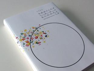
日本タイポグラフィ年鑑 2009
該年鑒屬日本字體設計協會(Japan Typograhy Association)官方出版物,本期版式及裝幀由南部俊安(Toshiyasu Nanbu)設計,Graphic-sha出版發行。 關於南部俊安: 1951年出生於大阪。1969年畢業於大阪都立工藝高等學校。1988年創建“Taste”設計公司 ── 日本從事設計項目和產品設計最主要的設計公司之一。1995年獲第7屆東京字體指導獎金獎(The 7th Tokyo Typedirection in Japan),2005及2007年香港設計師協會金獎獲得者,2007年ADI設計獎年度成就獎獲得者。 -
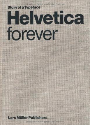
Helvetica forever
Designed in 1957, the Helvetica font is an icon of Swiss graphic design, which was a model of sober, functional communication throughout the world in the 1950s and 60s. The balanced and neutral appearance of Helvetica forgoes a high degree of expressivity a quality for which it is both criticized and admired. This polarization has helped to gain it unparalleled notoriety. Helvetica is far and away the most widely used of all typefaces; according to a survey by the Berliner Fontshop-Archiv, it tops the list of the hundred best fonts of all time. This publication retraces Helvetica s fifty-year history, compares it to the well-known sans serif fonts of the twentieth century, and examines the phenomenon of its unparalleled spread. Numerous illustrations show a multitude of ways the font has been used in five decades from a wide variety of fields from signal design to party flyers. -
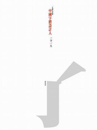
中國字體設計人:一字一生
我們每天接觸文字:報紙雜誌、廣告牌、餐單……。文字,從來就在我們生活中,只是鮮有人去細研中國文字的底蘊。「宋、仿、黑、楷」是中國第一批有系統的印刷字體。五十年代,中國需要統一和規範字體,出現了我們今天所尊稱的「字體設計人」。在電腦時代來臨之前,整個造字過程,從打手稿、修改、造鉛字、再修改、做模,全是人手工夫;他們一天才造好三至四個字。今天,雖則電腦簡化了造字的工序,但字體設計人的經驗仍需要承傳下去。本書收錄了十二位中國字體設計人的故事,作者用了超過八年時間進行訪談和資料搜集,細錄了從五十年代至今兩代字體設計人的造字故事,還有中國字的結構、美學,和欣賞。他們述說的,又豈止文字的故事,背後實在包含?生活、文化、經濟、政治和科技等。