-
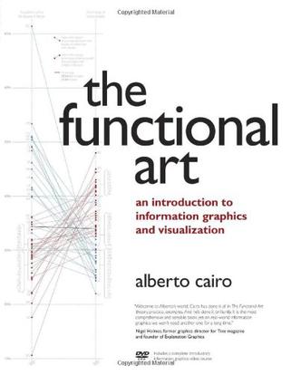
The Functional Art
Unlike any time before in our lives, we have access to vast amounts of free information. With the right tools, we can start to make sense of all this data to see patterns and trends that would otherwise be invisible to us. By transforming numbers into graphical shapes, we allow readers to understand the stories those numbers hide. In this practical introduction to understanding and using information graphics, you'll learn how to use data visualizations as tools to see beyond lists of numbers and variables and achieve new insights into the complex world around us. Regardless of the kind of data you're working with-business, science, politics, sports, or even your own personal finances-this book will show you how to use statistical charts, maps, and explanation diagrams to spot the stories in the data and learn new things from it. You'll also get to peek into the creative process of some of the world's most talented designers and visual journalists, including Conde Nast Traveler's John Grimwade, National Geographic Magazine's Fernando Baptista, The New York Times' Steve Duenes, The Washington Post's Hannah Fairfield, Hans Rosling of the Gapminder Foundation, Stanford's Geoff McGhee, and European superstars Moritz Stefaner, Jan Willem Tulp, Stefanie Posavec, and Gregor Aisch. The book also includes a DVD-ROM containing over 90 minutes of video lessons that expand on core concepts explained within the book and includes even more inspirational information graphics from the world's leading designers. The first book to offer a broad, hands-on introduction to information graphics and visualization, The Functional Art reveals: * Why data visualization should be thought of as "functional art" rather than fine art * How to use color, type, and other graphic tools to make your information graphics more effective, not just better looking * The science of how our brains perceive and remember information * Best practices for creating interactive information graphics * A comprehensive look at the creative process behind successful information graphics * An extensive gallery of inspirational work from the world's top designers and visual artists On the DVD-ROM: In this introductory video course on information graphics, Alberto Cairo goes into greater detail with even more visual examples of how to create effective information graphics that function as practical tools for aiding perception. You'll learn how to: incorporate basic design principles in your visualizations, create simple interfaces for interactive graphics, and choose the appropriate type of graphic forms for your data. Cairo also deconstructs successful information graphics from The New York Times and National Geographic magazine with sketches and images not shown in the book.
-
Beautiful Visualization
Visualization is the graphic presentation of data -- portrayals meant to reveal complex information at a glance. Think of the familiar map of the New York City subway system, or a diagram of the human brain. Successful visualizations are beautiful not only for their aesthetic design, but also for elegant layers of detail that efficiently generate insight and new understanding. This book examines the methods of two dozen visualization experts who approach their projects from a variety of perspectives -- as artists, designers, commentators, scientists, analysts, statisticians, and more. Together they demonstrate how visualization can help us make sense of the world. Explore the importance of storytelling with a simple visualization exercise Learn how color conveys information that our brains recognize before we're fully aware of it Discover how the books we buy and the people we associate with reveal clues to our deeper selves Recognize a method to the madness of air travel with a visualization of civilian air traffic Find out how researchers investigate unknown phenomena, from initial sketches to published papers Contributors include: Nick Bilton, Michael E. Driscoll, Jonathan Feinberg, Danyel Fisher, Jessica Hagy, Gregor Hochmuth, Todd Holloway, Noah Iliinsky, Eddie Jabbour, Valdean Klump, Aaron Koblin, Robert Kosara, Valdis Krebs, JoAnn Kuchera-Morin et al., Andrew Odewahn, Adam Perer, Anders Persson, Maximilian Schich, Matthias Shapiro, Julie Steele, Moritz Stefaner, Jer Thorp, Fernanda Viegas, Martin Wattenberg, and Michael Young. -
ggplot2
This book describes ggplot2, a new data visualization package for R that uses the insights from Leland Wilkison''s Grammar of Graphics to create a powerful and flexible system for creating data graphics. With ggplot2, it''s easy to: * produce handsome, publication-quality plots, with automatic legends created from the plot specification * superpose multiple layers (points, lines, maps, tiles, box plots to name a few) from different data sources, with automatically adjusted common scales * add customisable smoothers that use the powerful modelling capabilities of R, such as loess, linear models, generalised additive models and robust regression * save any ggplot2 plot (or part thereof) for later modification or reuse * create custom themes that capture in-house or journal style requirements, and that can easily be applied to multiple plots * approach your graph from a visual perspective, thinking about how each component of the data is represented on the final plot. This book will be useful to everyone who has struggled with displaying their data in an informative and attractive way. You will need some basic knowledge of R (i.e. you should be able to get your data into R), but ggplot2 is a mini-language specifically tailored for producing graphics, and you''ll learn everything you need in the book. After reading this book you''ll be able to produce graphics customized precisely for your problems, and you''ll find it easy to get graphics out of your head and on to the screen or page. -
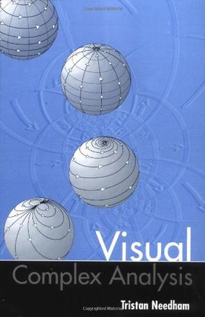
Visual Complex Analysis
Now available in paperback, this successful radical approach to complex analysis replaces the standard calculational arguments with new geometric ones. With several hundred diagrams, and far fewer prerequisites than usual, this is the first visual intuitive introduction to complex analysis. Although designed for use by undergraduates in mathematics and science, the novelty of the approach will also interest professional mathematicians. -
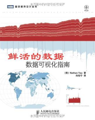
鲜活的数据
在生活中,数据几乎无处不在,任我们取用。然而,同样的数据给人的感觉可能会千差万别:或冰冷枯燥,让人望而生畏、百思不解其意;或生动有趣,让人一目了然、豁然开朗。为了达到后一种效果,我们需要采用一种特别的方式来展示数据,来解释、分析和应用它。这就是数据可视化技术。Nath an Yau是这一创新领域的先锋。在本书中,他根据数据可视化的工作流程,先后介绍了如何获取数据,将数据格式化,用可视化工具(如R)生成图表,以及在图形编辑软件(如Illustrator)中修改以使图表达到最佳效果。本书介绍了数十种方法(如柱形图、饼图、折线图和散点图等),以创造性的视觉方式生动讲述了有关数据的故事。 -
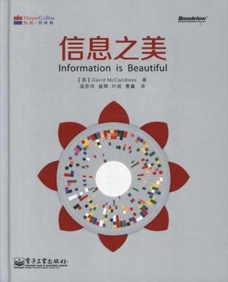
信息之美
《信息之美》告诉读者信息视觉效果的显示和信息如何关联,以及和这些信息相关的事实,让信息设计更有意思,信息决策更高效。我们生活在一个信息爆炸的时代,每一分钟、每一秒钟都会从电视、报纸或互联网获得信息,我们甚至都来不及思索,就已经被这些信息淹没。所以,我们需要一种新的方法,来发现信息的美和乐趣。《信息之美》作者花了一年的时间,收集了200多个新的图像信息设计案例,并探索出一系列视觉主题。