-
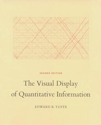
The Visual Display of Quantitative Information
The classic book on statistical graphics, charts, tables. Theory and practice in the design of data graphics, 250 illustrations of the best (and a few of the worst) statistical graphics, with detailed analysis of how to display data for precise, effective, quick analysis. Design of the high-resolution displays, small multiples. Editing and improving graphics. The data-ink ratio. Time-series, relational graphics, data maps, multivariate designs. Detection of graphical deception: design variation vs. data variation. Sources of deception. Aesthetics and data graphical displays. This is the second edition of The Visual Display of Quantitative Information. Recently published, this new edition provides excellent color reproductions of the many graphics of William Playfair, adds color to other images, and includes all the changes and corrections accumulated during 17 printings of the first edition. This book celebrates escapes from the flatlands of both paper and computer screen, showing superb displays of high-dimensional complex data. The most design-oriented of Edward Tufte's books, Envisioning Information shows maps, charts, scientific presentations, diagrams, computer interfaces, statistical graphics and tables, stereo photographs, guidebooks, courtroom exhibits, timetables, use of color, a pop-up, and many other wonderful displays of information. The book provides practical advice about how to explain complex material by visual means, with extraordinary examples to illustrate the fundamental principles of information displays. Topics include escaping flatland, color and information, micro/macro designs, layering and separation, small multiples, and narratives. Winner of 17 awards for design and content. 400 illustrations with exquisite 6- to 12-color printing throughout. Highest quality design and production. Visual Explanations: Images and Quantities, Evidence and Narrative is about pictures of verbs, the representation of mechanism and motion, process and dynamics, causes and effects, explanation and narrative. Practical applications and examples include statistical graphics, charts for making important decisions in engineering and medicine, technical manuals, diagrams, design of computer interfaces and websites and on-line manuals, animations and scientific visualizations, techniques for talks, and design strategies for enhancing the rate of information transfer in print, presentations, and computer screens. The use of visual evidence in deciding to launch the space shuttle Challenger is discussed in careful detail. Video snapshots show redesigns of a supercomputer animation of a thunderstorm. The book is designed and printed to the highest standards, with luscious color throughout and four built-in flaps for showing motion and before/after effects. -

信息设计
《信息设计》以一种极具启发性的方式展示了一系列振奋人心的设计作品,表现了形式与功能的完美均衡,切实而深入地探讨了对于信息的组织与视觉呈现。针对各种需求——无论是为了引导用户浏览文件、帮助他们规划自己的生活,还是在自然环境中为他们指明方向,《信息设计》满载着最为精华的“设计原则”与解答问题的“小贴士”,为你带来了所有能够创造出有效信息图形的钥匙。同时,这本书也着眼于如何将各种不同类型的信息设计融入整体设计方案之中,无论是为交通运输网、公用事业机构,还是为零售企业进行整体设计。 设计如何在富有视觉冲击力的同时,又能简明扼要、直切主题,并极具功能性呢?又是如何在具备强有力的视觉力量的同时,还能在受众面前化于“无形”之中呢?《信息设计》一书详细解答了这些问题,为设计实践打下了良好的基础,并提供了广阔的设计平台。 -
The Visual Display of Quantitative Information
-
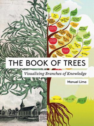
The Book of Trees
Our critically acclaimed bestseller Visual Complexity was the first in-depth examination of the burgeoning field of information visualization. Particularly noteworthy are the numerous historical examples of past efforts to make sense of complex systems of information. In this new companion volume, The Book of Trees, data viz expert Manuel Lima examines the more than eight hundred year history of the tree diagram, from its roots in the illuminated manuscripts of medieval monasteries to its current resurgence as an elegant means of visualization. Lima presents two hundred intricately detailed tree diagram illustrations on a remarkable variety of subjects, from some of the earliest known examples from ancient Mesopotamia to the manuscripts of medieval monasteries to contributions by leading contemporary designers. A timeline of capsule biographies on key figures in the development of the tree diagram rounds out this one-of-a-kind visual compendium. -Tree diagrams suggest strategies for representing data across many disciplines, including science, law, geneology, linguistics, economics, and sociology -Includes fascinating examples, such as early conceptualizations of heaven and hell, kinship diagrams of kings of France and West Virginian mountaineers, and analyses of recipe ingredients' -
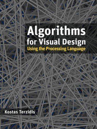
Algorithms for Visual Design Using the Processing Language
As the first book to share the necessary algorithms for creating code to experiment with design problems in the processing language, this book offers a series of generic procedures that can function as building blocks and encourages you to then use those building blocks to experiment, explore, and channel your thoughts, ideas, and principles into potential solutions. The book covers such topics as structured shapes, solid geometry, networking and databases, physical computing, image processing, graphic user interfaces, and more. -
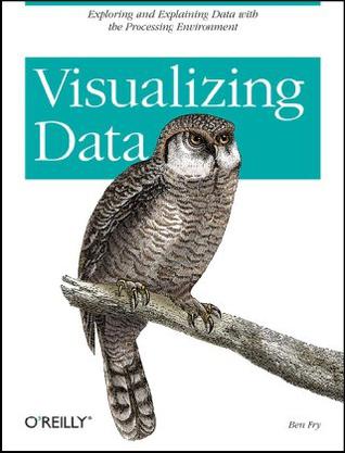
Visualizing Data
Enormous quantities of data go unused or underused today, simply because people can't visualize the quantities and relationships in it. Using a downloadable programming environment developed by the author, Visualizing Data demonstrates methods for representing data accurately on the Web and elsewhere, complete with user interaction, animation, and more. How do the 3.1 billion A, C, G and T letters of the human genome compare to those of a chimp or a mouse? What do the paths that millions of visitors take through a web site look like? With Visualizing Data, you learn how to answer complex questions like these with thoroughly interactive displays. We're not talking about cookie-cutter charts and graphs. This book teaches you how to design entire interfaces around large, complex data sets with the help of a powerful new design and prototyping tool called "Processing". Used by many researchers and companies to convey specific data in a clear and understandable manner, the Processing beta is available free. With this tool and Visualizing Data as a guide, you'll learn basic visualization principles, how to choose the right kind of display for your purposes, and how to provide interactive features that will bring users to your site over and over. This book teaches you: * The seven stages of visualizing data -- acquire, parse, filter, mine, represent, refine, and interact * How all data problems begin with a question and end with a narrative construct that provides a clear answer without extraneous details * Several example projects with the code to make them work * Positive and negative points of each representation discussed. The focus is on customization so that each one best suits what you want to convey about your data set The book does not provide ready-made "visualizations" that can be plugged into any data set. Instead, with chapters divided by types of data rather than types of display, you'll learn how each visualization conveys the unique properties of the data it represents -- why the data was collected, what's interesting about it, and what stories it can tell. Visualizing Data teaches you how to answer questions, not simply display information.