-
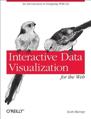
Interactive Data Visualization for the Web
Create and publish your own interactive data visualization projects on the Web, even if you have no experience with either web development or data visualization. It's easy with this hands-on guide. You'll start with an overview of data visualization concepts and simple web technologies, and then learn how to use D3, a JavaScript library that lets you express data as visual elements in a web page. Interactive Data Visualization for the Web makes these skills available at an introductory level for designers and visual artists without programming experience, journalists interested in the emerging data journalism processes, and others keenly interested in visualization and publicly available data sources. Get a practical introduction to data visualization, accessible for beginners Focus on web-based tools that help you publish your creations quickly to a wide audience Learn about interactivity so you can engage users in exploring your data -
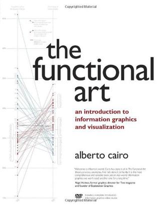
The Functional Art
Unlike any time before in our lives, we have access to vast amounts of free information. With the right tools, we can start to make sense of all this data to see patterns and trends that would otherwise be invisible to us. By transforming numbers into graphical shapes, we allow readers to understand the stories those numbers hide. In this practical introduction to understanding and using information graphics, you'll learn how to use data visualizations as tools to see beyond lists of numbers and variables and achieve new insights into the complex world around us. Regardless of the kind of data you're working with-business, science, politics, sports, or even your own personal finances-this book will show you how to use statistical charts, maps, and explanation diagrams to spot the stories in the data and learn new things from it. You'll also get to peek into the creative process of some of the world's most talented designers and visual journalists, including Conde Nast Traveler's John Grimwade, National Geographic Magazine's Fernando Baptista, The New York Times' Steve Duenes, The Washington Post's Hannah Fairfield, Hans Rosling of the Gapminder Foundation, Stanford's Geoff McGhee, and European superstars Moritz Stefaner, Jan Willem Tulp, Stefanie Posavec, and Gregor Aisch. The book also includes a DVD-ROM containing over 90 minutes of video lessons that expand on core concepts explained within the book and includes even more inspirational information graphics from the world's leading designers. The first book to offer a broad, hands-on introduction to information graphics and visualization, The Functional Art reveals: * Why data visualization should be thought of as "functional art" rather than fine art * How to use color, type, and other graphic tools to make your information graphics more effective, not just better looking * The science of how our brains perceive and remember information * Best practices for creating interactive information graphics * A comprehensive look at the creative process behind successful information graphics * An extensive gallery of inspirational work from the world's top designers and visual artists On the DVD-ROM: In this introductory video course on information graphics, Alberto Cairo goes into greater detail with even more visual examples of how to create effective information graphics that function as practical tools for aiding perception. You'll learn how to: incorporate basic design principles in your visualizations, create simple interfaces for interactive graphics, and choose the appropriate type of graphic forms for your data. Cairo also deconstructs successful information graphics from The New York Times and National Geographic magazine with sketches and images not shown in the book.
-
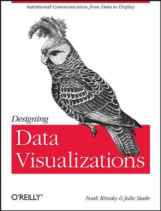
Designing Data Visualizations
Data visualization is an efficient and effective medium for communicating large amounts of information. But the design process can often seem like an unexplainable creative endeavor. This book aims to demystify the design process for those who are already comfortable with data analysis, showing the reader how to encode information visually via a linear process of decision-making. -
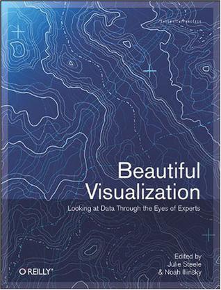
Beautiful Visualization
Visualization is the graphic presentation of data -- portrayals meant to reveal complex information at a glance. Think of the familiar map of the New York City subway system, or a diagram of the human brain. Successful visualizations are beautiful not only for their aesthetic design, but also for elegant layers of detail that efficiently generate insight and new understanding. This book examines the methods of two dozen visualization experts who approach their projects from a variety of perspectives -- as artists, designers, commentators, scientists, analysts, statisticians, and more. Together they demonstrate how visualization can help us make sense of the world. Explore the importance of storytelling with a simple visualization exercise Learn how color conveys information that our brains recognize before we're fully aware of it Discover how the books we buy and the people we associate with reveal clues to our deeper selves Recognize a method to the madness of air travel with a visualization of civilian air traffic Find out how researchers investigate unknown phenomena, from initial sketches to published papers Contributors include: Nick Bilton, Michael E. Driscoll, Jonathan Feinberg, Danyel Fisher, Jessica Hagy, Gregor Hochmuth, Todd Holloway, Noah Iliinsky, Eddie Jabbour, Valdean Klump, Aaron Koblin, Robert Kosara, Valdis Krebs, JoAnn Kuchera-Morin et al., Andrew Odewahn, Adam Perer, Anders Persson, Maximilian Schich, Matthias Shapiro, Julie Steele, Moritz Stefaner, Jer Thorp, Fernanda Viegas, Martin Wattenberg, and Michael Young. -
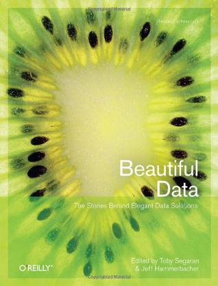
Beautiful Data
In this insightful book, you'll learn from the best data practitioners in the field just how wide-ranging - and beautiful - working with data can be. Join 39 contributors as they explain how they developed simple and elegant solutions on projects ranging from the Mars lander to a Radiohead video. With "Beautiful Data", you will: explore the opportunities and challenges involved in working with the vast number of datasets made available by the Web; learn how to visualize trends in urban crime, using maps and data mashups; discover the challenges of designing a data processing system that works within the constraints of space travel; also learn how crowdsourcing and transparency have combined to advance the state of drug research; and, understand how new data can automatically trigger alerts when it matches or overlaps pre-existing data. Learn about the massive infrastructure required to create, capture, and process DNA data. That's only small sample of what you'll find in "Beautiful Data". For anyone who handles data, this is a truly fascinating book. Contributors include: Nathan Yau; Jonathan Follett and Matt Holm; J.M. Hughes; Raghu Ramakrishnan, Brian Cooper, and Utkarsh Srivastava; Jeff Hammerbacher; Jason Dykes and Jo Wood; Jeff Jonas and Lisa Sokol; Jud Valeski; Alon Halevy and Jayant Madhavan; Aaron Koblin and Valdean Klump; Michal Migurski; Jeff Heer; Coco Krumme; Peter Norvig; Matt Wood and Ben Blackburne; Jean-Claude Bradley, Rajarshi Guha, Andrew Lang, Pierre Lindenbaum, Cameron Neylon, Antony Williams, and Egon Willighagen; Lukas Biewald and Brendan O'Connor; Hadley Wickham, Deborah Swayne, and David Poole; Andrew Gelman, Jonathan P. Kastellec, and Yair Ghitza; and, Toby Segaran.